Black and white kinetic typography is giving designers an expressive way to make words move without relying on bright colors or elaborate illustrations. From animated campaign headlines to short-form video captions, monochrome lettering can create rhythm, emphasis, and personality with only type, timing, and contrast.
The technique fits a larger conversation about expressive design in 2026. As more visual content competes for attention, the movement of a letter can help communicate an idea before a viewer finishes reading it. Yet successful kinetic typography is not simply text that spins, bounces, or flies across the screen. Its movement should reinforce what the words actually mean.
What Is Kinetic Typography?
Kinetic typography is the animation of written language. Designers change a word’s position, scale, opacity, spacing, or appearance over time, often synchronizing movement with narration, music, or editing. The result might be a dramatic title sequence, a memorable brand introduction, or a brief message that remains understandable without sound.
Unlike a conventional static layout, kinetic type adds time as a design element. A word can appear slowly to suggest calm, arrive abruptly to express urgency, or separate into individual characters to signal transformation. The fundamentals are still familiar: hierarchy, rhythm, alignment, and negative space. Our guide to contrast and composition in black and white explains why those relationships matter before animation begins.
Why Kinetic Typography Is Relevant in 2026
Typography-led storytelling is appearing throughout contemporary motion graphics and social content. Creative Bloq’s 2026 typography forecast identifies kinetic lettering as one of the ways designers are bringing character and emotion into type. Meanwhile, Nuevo Pixels’ motion graphics outlook describes animated text as a useful storytelling device for short-form video.
These forecasts do not mean every project needs constant movement. Rather, they show how typography is becoming more than a passive container for information. A brand can establish tone through the pace of a headline, while a creator can introduce a sequence through carefully staged words instead of a complicated visual effect.
That flexibility also makes motion type compatible with the restrained approach explored in our article on neo-minimalist branding. Minimalism and motion are not opposites. One strong animated phrase can carry an entire composition.
Why Black and White Works So Well
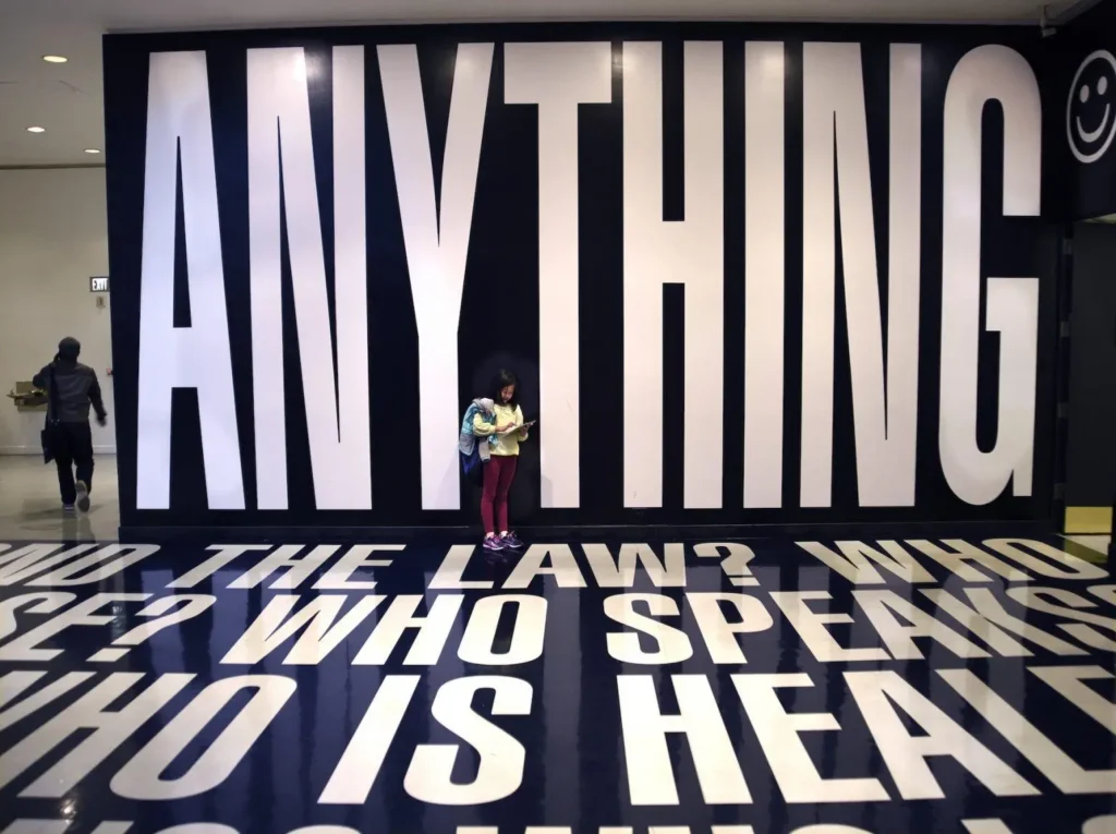
Without colorful accents, an animation’s structure becomes easier to examine. White lettering against a dark field can emphasize a single message; black text on an off-white surface can feel more editorial and understated. Gray can establish secondary information without competing with the main words.
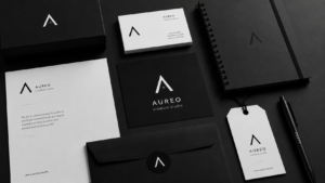
Monochrome also creates continuity between physical and digital brand materials. A company might use the same typography on stationery, packaging, a website, and a moving social video. The static identity remains recognizable while motion adds another dimension. This connection builds on the principles discussed in Monochrome Magic.
Five Kinetic Typography Techniques to Try
1. Scale and Reveal
Start with one keyword, then animate it from a smaller size to its final position. A restrained enlargement creates emphasis without needing extra graphical elements. For a polished result, use easing rather than an abrupt stop, and make sure the final frame holds long enough to read.
2. Letter-by-Letter Movement
Introduce characters sequentially to reveal a word gradually. Small differences in timing can create anticipation, while carefully spaced letters make each stage legible. This method works well for titles and logos, though complicated sentences rarely benefit from being revealed one character at a time.
3. Sliding Type and Direction
Move a phrase horizontally or vertically to guide the eye. A quick slide can suggest momentum; a slow upward movement can convey reflection or progress. Keeping the surrounding background still makes the action clearer and avoids excessive visual activity.
4. Changing Weight and Spacing
Text does not always need to travel across the screen. Animating letter spacing, line height, or font weight can create subtle motion while preserving the composition. When a typeface supports variable axes, controlled changes can be especially expressive. Test every intermediate state to avoid distorted or crowded letters.
5. Contrast Inversion
A transition from white letters on black to black letters on white can mark a change in mood or topic. Use it sparingly: rapid flashes and repeated full-screen inversions may distract viewers or create accessibility risks. A gentle fade or clean cut often communicates the shift more effectively.
Build a Motion Storyboard Before Animating
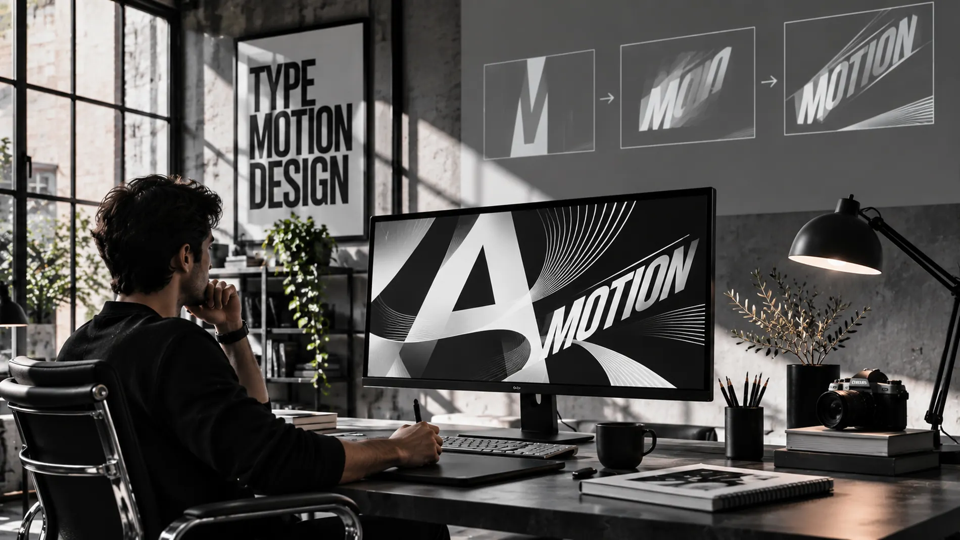
The best starting point is not software; it is a short sequence of still frames. Write down the message, choose the most important word, and decide what the viewer should notice first. Sketch the beginning, middle, and ending positions of the type. Then check whether the sequence is understandable as a set of static images.
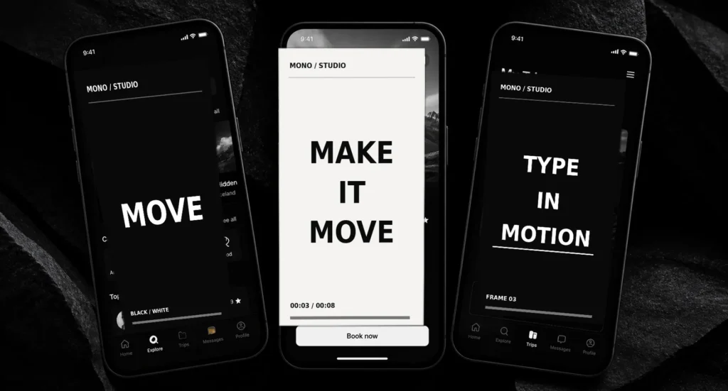
For example, a fictional creative studio could animate the phrase “Make It Move” in three beats. “Make” establishes the invitation, “It” creates a brief pause, and “Move” expands into the frame. That sequence has a purpose: the action visually demonstrates the statement.
Once the storyboard works, add timing. Test a slower version and a faster version rather than assuming speed creates excitement. Adobe’s After Effects text animation lessons cover text layers, keyframes, and techniques that can turn this basic plan into a finished sequence.
Applications for Social Videos and Branding
Short-form video is an obvious use case, particularly when viewers may initially watch without sound. Large animated keywords can complement captions, but they should not replace accurate subtitles. Keep complete spoken information available while using motion to emphasize selected phrases.
Animated typography can also support product launches, brand reveals, exhibition screens, event openers, and website hero sections. A restrained black-and-white title sequence may feel especially consistent with a premium identity, whereas irregular type movement may suit experimental music or arts projects.
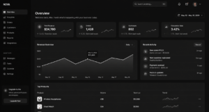
For websites, restraint matters. Moving text should support the actual content rather than force users to wait for a message to appear. A static headline with a brief optional animation can be more practical than a continuous loop. The same consideration applies to the dark interfaces discussed in our monochrome UI guide.
Accessibility Is Part of Good Motion Design
Motion should never be the only way a user receives essential information. Some viewers experience discomfort from large panning or scaling effects, while others need more time to read. The MDN guide to prefers-reduced-motion explains how websites can respect an operating-system setting that requests less animation.
For moving content that starts automatically and continues beyond five seconds alongside other content, relevant conditions in WCAG’s Pause, Stop, Hide guidance require a mechanism to pause, stop, or hide the movement unless it is essential. Designers should also avoid dangerous flashing, provide readable static states, and test contrast throughout the transition.
A useful habit is to ask whether the message still works when the animation is paused. If not, simplify the motion or provide a reliable alternative.
Common Mistakes That Weaken Animated Type
- Too many effects: Combining bouncing, spinning, blur, and distortion makes a short message harder to follow.
- Insufficient reading time: Words that disappear immediately may look energetic but communicate very little.
- Weak hierarchy: If every word is equally large and animated, no clear focal point remains.
- Ignoring mobile screens: Fine strokes and small subtitles may become illegible after a video is reduced.
- Unnecessary loops: Constantly moving headlines can compete with the rest of a page.
When troubleshooting, return to a static version of the composition. If it lacks a clear hierarchy without animation, adding motion rarely fixes the underlying problem.
Where Monochrome Motion Design Goes Next
New tools continue to make text animation easier, but the most distinctive results still depend on design judgment. Our discussion of AI-assisted monochrome design explores how automated tools can support rather than replace creative direction. Timing, composition, typography, and restraint determine whether a sequence feels memorable or disposable. Adobe’s current text animator documentation illustrates the range of properties that can be controlled, from entire layers to individual characters.
For creators who already love the clarity of black and white, kinetic typography offers a natural next experiment: introducing movement without abandoning simplicity. Whether viewed on a phone or across a gallery wall, carefully animated words can communicate a visual identity with surprising economy.
Conclusion
Black and white kinetic typography is compelling because it combines timeless visual principles with the possibilities of motion. By choosing one clear message, creating a simple storyboard, and using movement intentionally, designers can make typography feel expressive without overwhelming the audience. In 2026, the opportunity is not to animate everything. It is to find the few words that become stronger when they move.