Dark mode monochrome design has rapidly become one of the most influential trends in digital design. From mobile apps to premium websites, brands are embracing black and white interfaces to create cleaner visuals, reduce eye strain, and deliver a more refined user experience. This shift reflects a growing demand for simplicity, elegance, and functionality in modern design.
If you’ve explored minimalist design concepts, you’ve likely seen how monochrome plays a central role. Dark mode takes that idea further by combining contrast, usability, and visual comfort into one cohesive design strategy.
Why Dark Mode Is Dominating Digital Design
Dark mode is no longer just a feature. It has become a design standard across platforms like iOS, Android, and major websites. Users now expect interfaces that adapt to their preferences, and dark mode delivers both comfort and style.
One major reason behind its popularity is reduced eye strain. Bright screens can cause fatigue, especially in low-light environments. Dark backgrounds with light text create a softer visual experience that feels easier on the eyes.
According to Nielsen Norman Group, dark mode can improve usability when applied correctly, especially for prolonged screen use.
The Role of Monochrome in Dark Mode UI
Monochrome design enhances dark mode by removing unnecessary color distractions. Instead of relying on multiple hues, designers focus on contrast, typography, and spacing.
This approach creates a clean and intentional interface. Every element has purpose. Every detail stands out.
If you’ve read our insights on design principles, you already know that contrast is key. Dark mode monochrome design uses this principle to guide user attention and improve navigation.
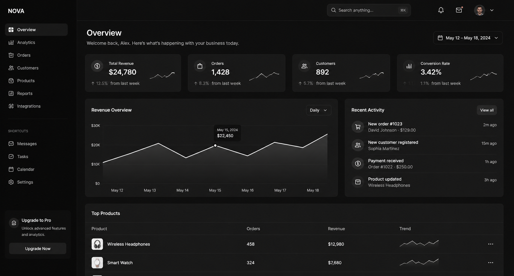
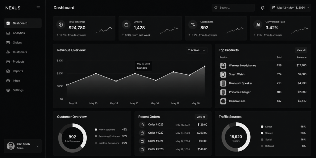
Benefits of Dark Mode Monochrome Design
1. Improved Readability
High contrast between black backgrounds and white text enhances readability when designed properly. It reduces glare and allows users to focus on content without visual overload.
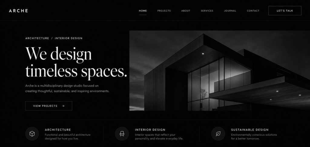
2. Modern and Premium Aesthetic
Monochrome dark mode interfaces often feel more sophisticated. Many high-end brands and tech companies adopt this style to create a sleek and professional appearance.
3. Battery Efficiency
On OLED and AMOLED screens, dark mode can reduce power consumption. This adds a practical benefit that users appreciate.
Learn more about this from Android Authority.
4. Focused User Experience
Without bright colors competing for attention, users can focus on the content and actions that matter most.
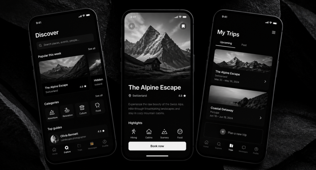
How Brands Use Dark Mode to Stand Out
Tech companies like Apple and Spotify have refined dark mode experiences that highlight content while maintaining simplicity.
Platforms such as Apple Human Interface Guidelines emphasize clarity and depth when designing dark interfaces.
Meanwhile, websites featured on Awwwards often showcase innovative monochrome UI designs that push creative boundaries.
Design Tips for Effective Monochrome Dark Mode
Use True Contrast
Avoid pure black and pure white in some cases. Slight variations like dark gray and off-white can create a more comfortable reading experience.
Focus on Typography
Typography becomes more important in monochrome design. Choose fonts that are clean, readable, and visually balanced.
Incorporate Depth
Use shadows, gradients, and layering to add dimension. Flat black surfaces can feel lifeless without subtle depth cues.
Highlight Key Elements
Use minimal accent colors or brighter whites to guide attention toward buttons or important actions.
You can explore more inspiration from Dribbble dark mode designs.
Dark Mode and the Future of Minimalism
Dark mode monochrome design represents the evolution of minimalism. It strips away unnecessary elements and focuses on what truly matters: usability, clarity, and elegance.
As digital experiences continue to grow, this approach may remain a core design standard across industries.
If you enjoy exploring minimalist aesthetics, you might also like our content on graphic design, where the same principles apply in physical spaces.
Conclusion
Dark mode monochrome design is more than just a visual trend. It reflects a shift toward thoughtful, user-centered design that prioritizes comfort, clarity, and sophistication.
Whether you’re designing a website, app, or brand identity, embracing this approach may help create a more modern and engaging experience.