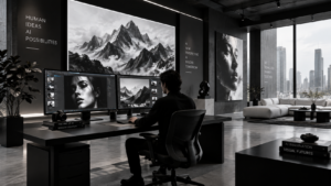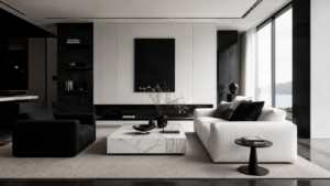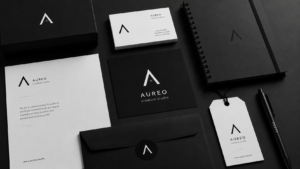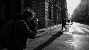
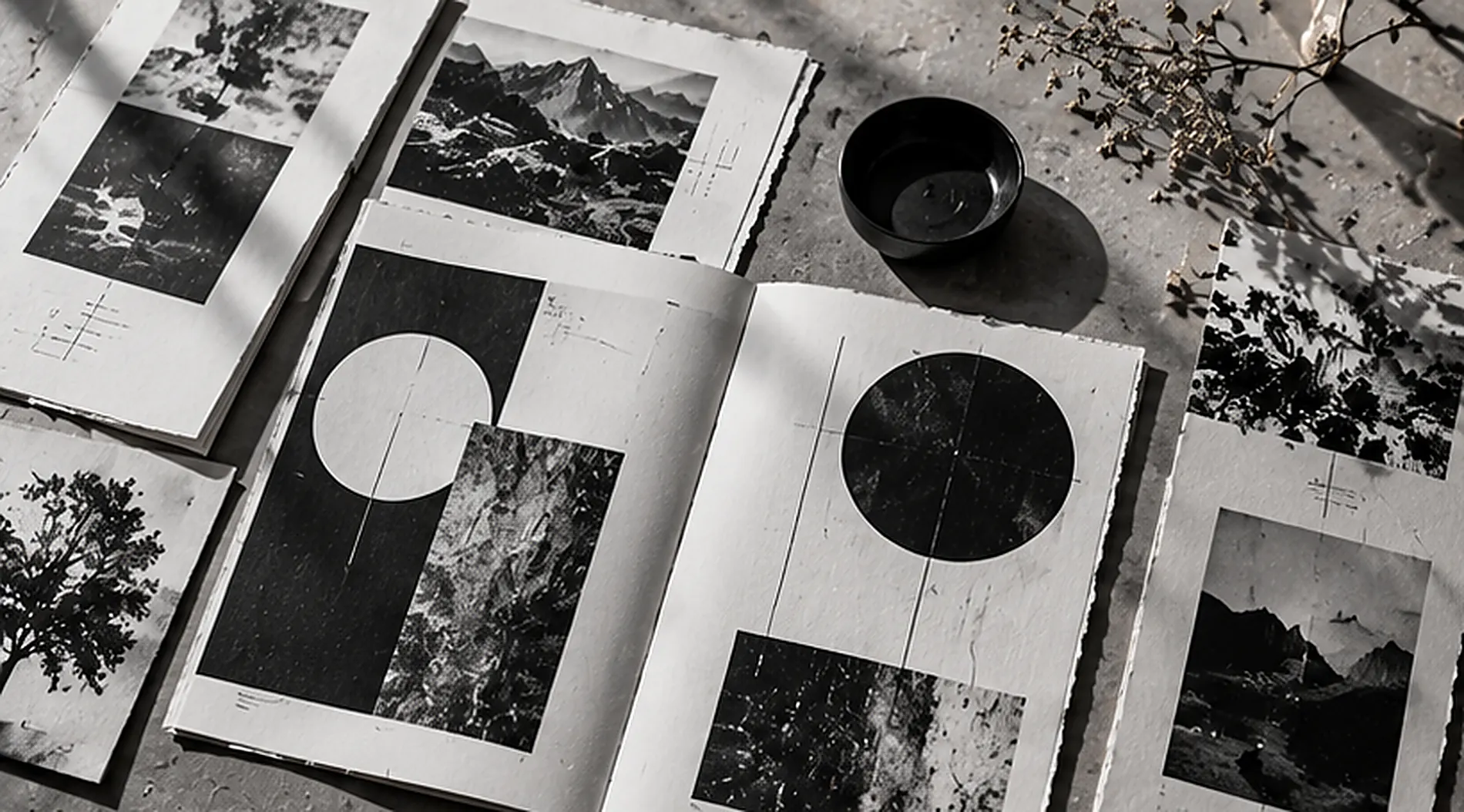
Black and white texture design is gaining fresh attention in 2026, but its appeal is surprisingly physical. Designers are bringing paper grain, photocopy marks, imperfect ink, and handmade details into otherwise polished layouts. The result is monochrome work that feels less like a template and more like something a person actually made.
This return to tactile design is not a rejection of digital tools. It is a response to the sheer volume of smooth, instantly generated visuals competing for attention. A creased paper edge or slightly uneven printed shape gives a composition a distinctive character. In black and white, those small details become especially noticeable because color is not doing the storytelling.
Why Analog Texture Is Trending in 2026
Several 2026 creative forecasts identify handmade character and sensory detail as major design directions. Adobe’s 2026 design trends report highlights tactile surfaces, organic imperfections, and collage. Creative Bloq’s industry roundup likewise describes growing interest in physical craft as a counterpoint to hyper-polished digital imagery.
The important distinction is that texture is not a shortcut to authenticity. Adding random scratches to every design will quickly look artificial. The more compelling approach is to choose materials and marks that support the subject: rough photocopy grain for an underground music poster, subtle paper fibers for an editorial magazine, or a pressed impression for premium stationery.
Why Texture Matters More in Black and White
When designers limit themselves to black, white, and gray, they lose the easy differentiation supplied by bright colors. Texture becomes another way to establish contrast, hierarchy, and mood. A dense patch of printer noise can make a headline feel urgent; a soft uncoated-paper surface can make a minimalist invitation feel quiet and intimate.
Texture also creates a relationship between foreground and background. Smooth typography against grainy photography feels deliberate because the surfaces behave differently. For a stronger foundation, revisit our guide to contrast and composition in black and white. The same principles of balance and visual weight apply when the contrast comes from material rather than color.
Five Analog Effects Worth Exploring
1. Photocopy Grain and Toner Marks
A photocopied sheet can contain tiny speckles, crushed shadows, uneven edges, and slight loss of fine detail. These artifacts give black and white posters a raw, documentary quality. Try copying a photograph, copying the copy again, and scanning the result. Each generation changes the image in ways a perfect digital filter may not replicate.
Use the effect for music artwork, experimental editorial spreads, or campaign graphics that need urgency. Keep supporting information crisp so the texture does not interfere with essential details.
2. Halftone Dots
Halftones translate tonal variation into patterns of dots or lines. Viewed closely, the structure is visible; from a distance, it creates the impression of shades of gray. A bold halftone portrait can carry a poster without any additional color, especially when paired with generous margins and clean lettering.
Experiment with dot size and frequency, but test the result at its actual printed or displayed dimensions. Patterns that look striking at full screen can merge into muddy blocks when reduced.
3. Risograph-Inspired Printing
Risograph printing uses stencils and ink drums to create repeated impressions. The process is prized by independent publishers and artists for its distinctive texture and occasional registration differences. The Williams College Libraries’ Risograph guide explains how the stencil-based system works, while MICA’s file-preparation guide shows why grayscale artwork matters to the process.
Although risograph printing can use vivid spot colors, a black-ink, single-color approach fits monochrome projects beautifully. Its appeal comes from the printed result, not from pretending every grainy digital image was physically produced on a press.
4. Torn Paper and Physical Collage
Collage introduces irregular edges, visible layers, and small shadows that suggest physical depth. Start with black construction paper, white photocopies, and printed photographs. Arrange them by hand, photograph the layout in soft daylight, and then refine the composition digitally.
Physical layering works particularly well when a project needs energy without adding color. A dramatic silhouette can sit alongside fragmented type, while a largely empty background keeps the composition readable.
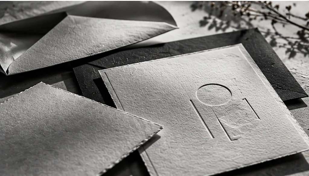
5. Letterpress and Embossed Surfaces
At the opposite end of the visual spectrum, letterpress impressions and embossed paper can introduce quiet sophistication. Rather than making a design louder, these details ask the viewer to notice subtle shadows and changes in surface height. They suit invitations, book covers, packaging, and stationery where the printed object itself is part of the experience.
How to Build an Analog Monochrome Design
You do not need an expensive print studio to try these techniques. A practical workflow begins with ordinary materials and deliberate choices:
- Choose a clear message. Decide whether the visual should feel rebellious, nostalgic, editorial, or refined before selecting textures.
- Collect original surfaces. Scan torn paper, ink marks, folded sheets, or photocopied images at a useful resolution.
- Start in grayscale. Adjust levels until the details remain visible without turning the entire composition into gray noise.
- Combine rough and clean elements. Use one prominent texture, then contrast it with readable typography or orderly spacing.
- Make real-size proofs. Check how the design looks on paper, on a laptop, and on a phone before finalizing it.
A helpful exercise is to create three versions of the same poster: one completely clean, one with restrained paper grain, and one with aggressive photocopy distortion. Comparing them makes it easier to identify how much texture the message actually needs.
From Printed Paper to Digital Screens
Analog character can also work in website headers, portfolios, social graphics, and editorial landing pages. The challenge is keeping the page usable. Texture is usually most effective in photography, backgrounds, or decorative panels, while navigation labels and body text stay crisp.
Digital designers should also test readability rather than assuming black and white guarantees accessibility. The W3C’s contrast guidance specifies a minimum contrast ratio of 4.5:1 for most normal-size text and 3:1 for qualifying large text at WCAG AA. Grain, transparency, and overlapping imagery can reduce effective contrast even when the original palette seems bold.
For faster-loading pages, export photographs and textured backgrounds as appropriately compressed WebP images. Avoid turning paragraphs into pictures of text: real HTML text remains easier to resize, select, search, and read with assistive technology.
How This Trend Fits Modern Branding
The tactile revival offers an interesting counterpoint to the stripped-back branding explored in our article on neo-minimalist black and white branding. Both approaches value intention. Neo-minimalism often removes decoration; tactile design gives selected imperfections a deliberate role. A brand can use a simple logo while allowing its magazine, campaign photography, or seasonal packaging to feel more handmade.
Neither style is universally better. A luxury fragrance label might benefit from subtle embossing, while an independent arts festival might choose gritty photocopy posters. Wacom’s 2026 trend analysis points to expressive typography and modern nostalgia alongside bold minimalism, demonstrating that contemporary design has room for more than one visual language.
Common Mistakes to Avoid
Overusing distress: If every photograph, letter, and border has rough edges, the design loses hierarchy. Give the eye at least one place to rest.
Confusing imperfection with authenticity: Fake print defects can be a legitimate artistic choice, but do not claim a piece was handcrafted or risograph-printed unless it really was.
Ignoring the medium: Fine grain may disappear on a phone; oversized dots can overpower a business card. Adjust textures for each output rather than exporting one master file everywhere.
Forgetting image rights: Use your own scans and photographs or obtain appropriate licenses for archival images and stock textures.
The Future of Handmade-Looking Design
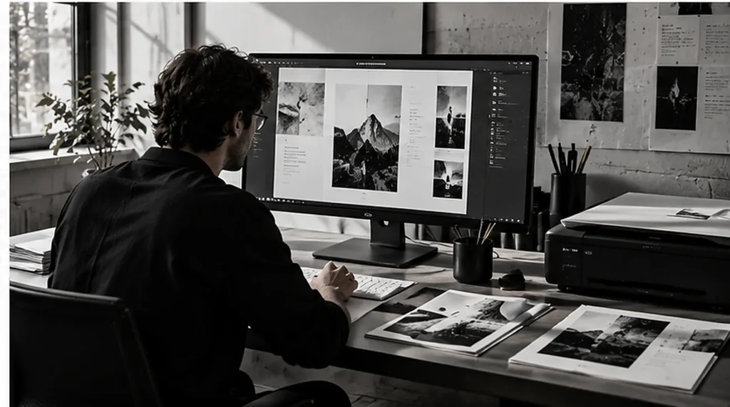
Black and white texture design is not a prediction that clean interfaces or AI-generated art will disappear. In fact, digital tools make it easier to combine physical processes with precise modern editing. A designer might scan a hand-printed sheet, refine its contrast on a computer, then turn the result into an accessible website banner or professionally printed book cover.
The creative opportunity lies in that combination. Black and white remains a flexible foundation, but paper fibers, uneven ink, and other tactile details can make familiar layouts feel personal again. For more inspiration on building expressive work from a limited palette, explore Monochrome Magic.
Conclusion
The analog texture revival shows that memorable design does not always require brighter colors or more elaborate effects. A thoughtful mixture of physical marks, monochrome contrast, and clear typography can communicate personality while preserving focus. The strongest work uses texture as a storytelling tool, not a layer added simply because it is fashionable.
Whether you experiment with photocopies, risograph prints, embossed stationery, or scanned collages, begin with a strong composition. Then allow the imperfections that support your message to become part of its identity.