Minimalism in design has gained traction across industries, and at its core lies the power of monochrome. By using a single color or shades of one tone, designers create visual unity that is bold yet refined. Monochrome design proves that fewer choices can lead to greater impact.
What is Monochrome Design?
Monochrome doesn’t mean only black and white. It can also mean:
-
Variations of one color (e.g., navy to sky blue)
-
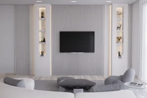
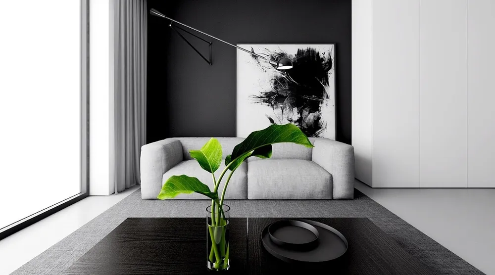
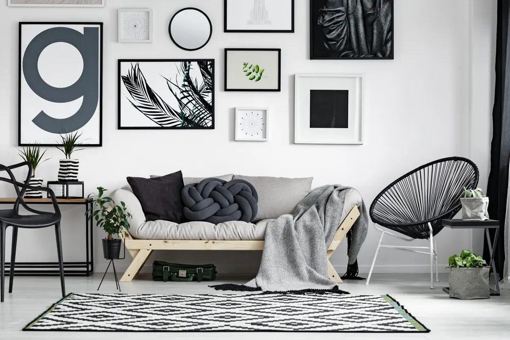
A grayscale scheme
-
Simplified palettes that rely on tonal contrast rather than color diversity
Why Monochrome Works So Well
-
Cohesion: Everything feels connected and deliberate.
-
Focus: Fewer distractions mean stronger messaging.
-
Flexibility: Works across web, print, packaging, and interiors.
-
Timelessness: Avoids the risk of looking dated too quickly.
Examples in Branding
-
Chanel: Black and white elegance for luxury branding.
-
Spotify Wrapped visuals: Often lean on a single, vibrant color per campaign.
-
Architectural studios: Frequently use grayscale to emphasize form over decoration.
The Psychology of Monochrome
-
Black & white: Professional, serious, timeless.
-
Single-color schemes: Evoke mood (blue = calm, red = passion, green = balance).
-
Grayscale with hints: Allows one accent to shine while keeping the rest subdued.
Practical Applications
-
Web design: Simplify navigation and improve accessibility.
-
Packaging: Reinforces brand luxury through minimalism.
-
Posters: Create strong visual identity with just one bold color on white.
Tips for Designers
-
Choose fonts with personality to compensate for limited color.
-
Use contrast and space to prevent flatness.
-
Introduce texture or pattern to enhance dimension.
Conclusion
Monochrome design is far from limiting—it is liberating. It sharpens creativity by forcing designers to think in structure, form, and emotion rather than relying on color variety.