The design landscape of 2026 is a vibrant, chaotic explosion of color and maximalist energy. Everywhere you look, brands are embracing hyper-saturated palettes, immersive 3D elements, and surreal imagery that demands immediate attention. However, amidst this overwhelming visual noise, a quiet but powerful counter-movement is taking root. Monochrome design in 2026 is emerging not just as an aesthetic choice, but as a deliberate rebellion against the relentless sensory overload of modern maximalism.
For designers and brands seeking to cut through the clutter, the strategic use of black, white, and grayscale offers a profound sense of clarity. While the broader industry chases the next fleeting trend, monochrome aesthetics remain steadfastly timeless. This article explores why restraint is becoming the most impactful design strategy of the year, and how embracing a limited palette can elevate your visual communication to new heights of sophistication.
The Rise of the Monochrome Rebellion
To understand the resurgence of monochrome design in 2026, we must first examine the context of the current creative climate. According to Adobe’s 2026 design trends forecast, the dominant trends of the year revolve around “all our senses to the max” and “maximalist, chaotic layouts.” These approaches rely on overwhelming the viewer with complex layers, vibrant color clashes, and unpredictable compositions. While these maximalist designs can be visually arresting, they often risk diluting the core message in a sea of visual competition.
In stark contrast, monochrome design strips away the superfluous, forcing the viewer to focus entirely on form, composition, and content. By eliminating the distraction of color, designers must rely on the fundamental principles of visual communication. This intentional limitation is precisely what makes monochrome so powerful. It is a confident declaration that the design itself is strong enough to stand without the crutch of a vibrant palette.
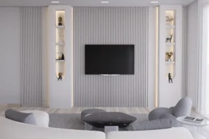
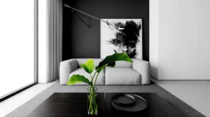
Furthermore, the shift towards monochrome is not limited to graphic design. Interior architecture is also seeing a significant move towards tonal restraint. According to Alternative Surfaces, designers are increasingly exploring nuance within a single color family, allowing subtle shifts in shade, light, and material to shape depth. This cross-disciplinary embrace of restraint highlights a broader cultural desire for visual calm and focused elegance.
Mastering Contrast and Composition
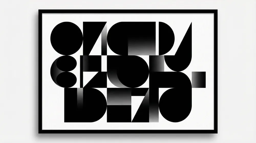
When color is removed from the equation, contrast and composition become the undisputed kings of the design hierarchy. In monochrome design, the interplay between light and dark is the primary tool for guiding the viewer’s eye and establishing visual hierarchy. Mastering this dynamic is essential for creating impactful black and white layouts.
High contrast between stark black and pure white creates immediate drama and legibility. This bold approach is particularly effective for typography-driven designs, where the message must be delivered with absolute clarity. Conversely, the subtle use of grayscale can introduce depth, texture, and nuance, softening the visual impact while maintaining a sophisticated edge. If you want to dive deeper into this topic, our guide on Contrast & Composition: Mastering Layout in Black and White offers comprehensive insights into balancing these elements.
Moreover, the absence of color demands a heightened attention to negative space. In monochrome design, the empty areas of a layout are just as important as the filled ones. Negative space provides breathing room, allowing the core elements to resonate more powerfully. This careful orchestration of positive and negative space is a hallmark of refined minimalist design — a principle that remains central to the monochrome aesthetic. The Interaction Design Foundation notes that negative space is one of the most powerful yet underutilized tools in a designer’s arsenal.
The Psychology of Grayscale
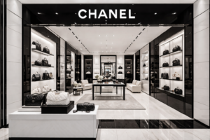
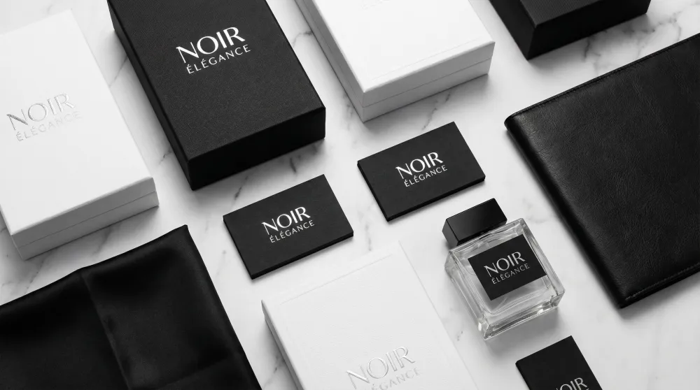
Beyond its visual impact, monochrome design carries significant psychological weight. Black is universally associated with luxury, authority, and sophistication. It conveys a sense of exclusivity and timeless elegance that high-end brands have leveraged for decades. White, on the other hand, represents purity, clarity, and modernism. Together, they form a visual language that speaks of uncompromising quality and refined taste.
The introduction of gray tones adds another layer of emotional complexity. Gray is often perceived as neutral, balanced, and professional. It bridges the stark divide between black and white, offering a spectrum of subtlety that can evoke everything from industrial grit to soft, ethereal calm. Understanding how to manipulate these emotional resonances is crucial for designers working within a limited palette. For a more detailed exploration of this spectrum, consider reading our article Between the Lines: Exploring the Subtle Beauty of Gray Tones.
In 2026, as audiences become increasingly fatigued by the relentless optimism of hyper-saturated branding, the grounded, serious tone of monochrome offers a refreshing alternative. It signals authenticity and substance, suggesting that the brand values clarity and purpose over superficial flashiness. Research from Canva’s 2026 design trends report confirms that audiences are increasingly drawn to designs that feel genuine and purposeful rather than visually overwhelming.
Texture and Typography in a Colorless World
Without color to differentiate elements, texture and typography take on elevated importance in monochrome design. Texture introduces tactile qualities to digital and print media, preventing flat designs from feeling sterile or monotonous. Whether it is the subtle grain of a photograph, the rough edge of a distressed font, or the smooth gradient of a digital illustration, texture provides the necessary visual interest to keep the viewer engaged.
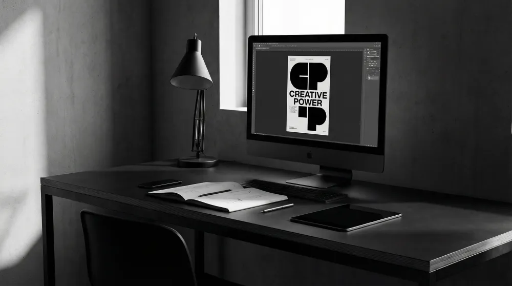
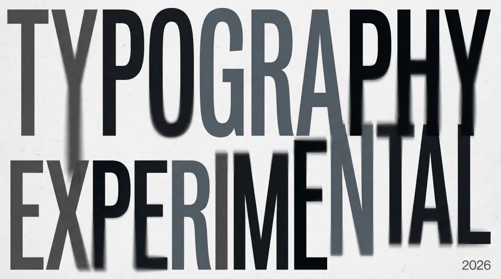
Typography, meanwhile, becomes the primary vehicle for expression. In 2026, we are seeing a fascinating intersection between monochrome aesthetics and experimental typography. Designers are utilizing exaggerated, playful letterforms and distorted fonts to inject personality into black and white layouts — a trend highlighted in It’s Nice That’s forward-thinking graphic trends for 2026. This juxtaposition of a restrained palette with expressive typography creates a dynamic tension that is highly characteristic of contemporary design.
The careful selection of typefaces is paramount. A sleek, geometric sans-serif can reinforce a modern, minimalist aesthetic, while a classic serif can evoke a sense of heritage and editorial authority. When combined with thoughtful kerning and leading, typography in a monochrome setting transcends mere text to become a central graphic element in its own right. To understand the foundational rules that govern these decisions, our Design Principles section provides an essential reference for both emerging and experienced designers.
The Future of Monochrome Aesthetics
As we look ahead, it is clear that monochrome design is not merely a passing trend, but a foundational pillar of visual communication. Its ability to convey complex ideas with absolute clarity ensures its enduring relevance. In an era defined by digital noise and visual saturation, the deliberate choice to embrace restraint is a powerful statement of intent.
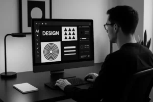
The integration of new technologies is also shaping the future of this aesthetic. Artificial intelligence, for instance, is providing designers with unprecedented tools for generating and manipulating black and white imagery. This technological advancement is opening up new avenues for creative exploration, allowing for the creation of hyper-realistic textures and surreal compositions that were previously impossible. To learn more about this intersection, explore our in-depth piece on The New Monochrome: How AI-Assisted Design is Revolutionizing Black and White Aesthetics. Additionally, UX Collective’s analysis of 2026 experience design trends underscores how calm, focused design modes are gaining traction across digital platforms.
Ultimately, the true power of monochrome design in 2026 lies in its versatility. It can be stark and aggressive, or soft and poetic. It can communicate the highest echelons of luxury, or the rawest forms of underground rebellion. By stripping away the distraction of color, designers are free to explore the pure essence of visual form, proving once again that sometimes, less truly is infinitely more.
Embracing the Monochrome Philosophy
Adopting a monochrome approach requires a fundamental shift in how we think about design. It demands discipline, precision, and a deep understanding of visual fundamentals. However, the rewards for mastering this aesthetic are substantial. Designs created with a limited palette possess a timeless quality that transcends the fleeting trends of the moment.
For brands looking to establish a strong, memorable identity in 2026, monochrome offers a distinct competitive advantage. It cuts through the visual clutter, delivering messages with unparalleled clarity and sophistication. By embracing restraint, designers can create work that is not only visually striking but also deeply resonant. Explore how some of the world’s most iconic brands have done exactly this in our feature on Shades of Sophistication: The Power of Black, White & Grayscale in Graphic Design.
As the design world continues to oscillate between maximalism and minimalism, the monochrome aesthetic remains a steadfast anchor. It is a reminder that true creativity does not require a rainbow of colors to make an impact. In the end, the most powerful designs are often those that dare to speak in black and white.