In design, contrast is king. Black and white layouts embody this principle by using pure opposites to maximize impact. Whether for editorial spreads, websites, or posters, black and white layouts rely on contrast and composition to tell a story effectively.
The Role of Contrast in Design
Contrast enhances hierarchy, focus, and visual rhythm. Designers use it to:
-
Differentiate headlines from body text
-
Guide the eye through a layout
-
Create drama and emphasis
Composition Basics in Black & White
Since color is absent, designers rely heavily on:
-
Alignment: Organizing content with grids.
-
Balance: Distributing weight through shapes and typography.
-
Whitespace: Using emptiness as a design element.
Typography & Contrast
Black on white remains the gold standard for legibility, but reversed type (white on black) adds sophistication. Effective use of contrast means:
-
Combining serif and sans serif fonts
-
Playing with scale (oversized headlines vs. minimal body copy)
-
Leveraging weight differences (bold vs. thin strokes)
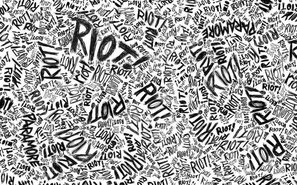
Black & White in Editorial Design
Magazines, newspapers, and modern zines use monochrome layouts for:
-
Elegance in feature articles
-
High contrast photography spreads
-
Minimalist design identities
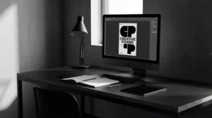
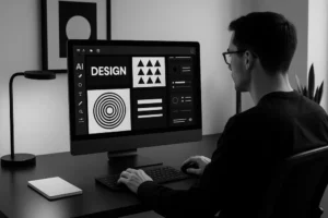
Digital Design Applications
-
Websites: Black and white landing pages feel modern and immersive.
-
Apps: Simple interfaces with monochrome icons improve usability.
-
Social media: Monochrome carousels stand out against colorful feeds.
Conclusion
Contrast and composition in black and white layouts sharpen focus, elevate brand aesthetics, and ensure timeless appeal. By relying on form and balance, designers craft visuals that communicate more with less.