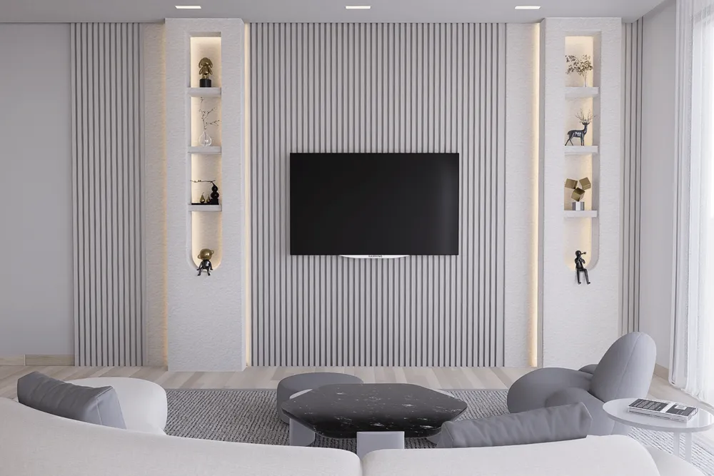
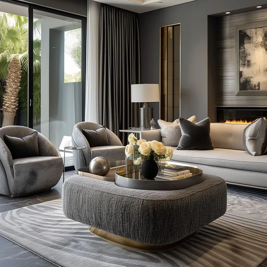
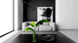
Gray is often overlooked in design, dismissed as dull or uninspiring. Yet, gray tones carry immense subtlety and sophistication. Between black and white lies a spectrum of emotion and elegance. Gray tones balance extremes, making them invaluable for designers who want to create understated yet powerful visuals.
The Psychology of Gray
-
Neutrality: Gray acts as a stabilizer in palettes.
-
Professionalism: Commonly associated with authority, balance, and maturity.
-
Versatility: Complements both bold and muted colors.
Gray in Branding
-
Tech companies often use gray to project stability.
-
Luxury brands employ light grays to convey minimalism.
-
Editorial design leverages gray backgrounds for sophistication.
Design Applications
-
Backgrounds: Soft gray prevents eye strain better than stark white.
-
Typography: Gray body text can feel gentle, especially for long reads.
-
UI/UX: Neutral gray icons reduce visual clutter in apps and websites.
Pairing Gray with Other Colors
-
Gray + Black: Creates strength and authority.
-
Gray + White: Softens harsh contrasts.
-
Gray + Bright Accent: Lets vibrant colors shine without overwhelming.
The Spectrum of Grays
-
Cool Grays: Blue-based, professional, calm.
-
Warm Grays: Brown-based, cozy, approachable.
-
Neutral Grays: Pure balance, highly versatile.
Conclusion
Gray tones are the unsung heroes of design. They bring nuance where extremes dominate, soften contrasts, and offer a quiet elegance. Designers who embrace gray tones unlock a sophisticated palette that enhances balance, mood, and timeless appeal.


